I'm an asset/environment artist for an AAA videogames company and I currently live in the UK. I love making game-art especially environments but I do like to challenge myself to create some organic stuff as well. My thoughts and opinion on this blog are personal.
Showing posts with label z-brush. Show all posts
Tuesday, May 9, 2017
Friday, August 29, 2014
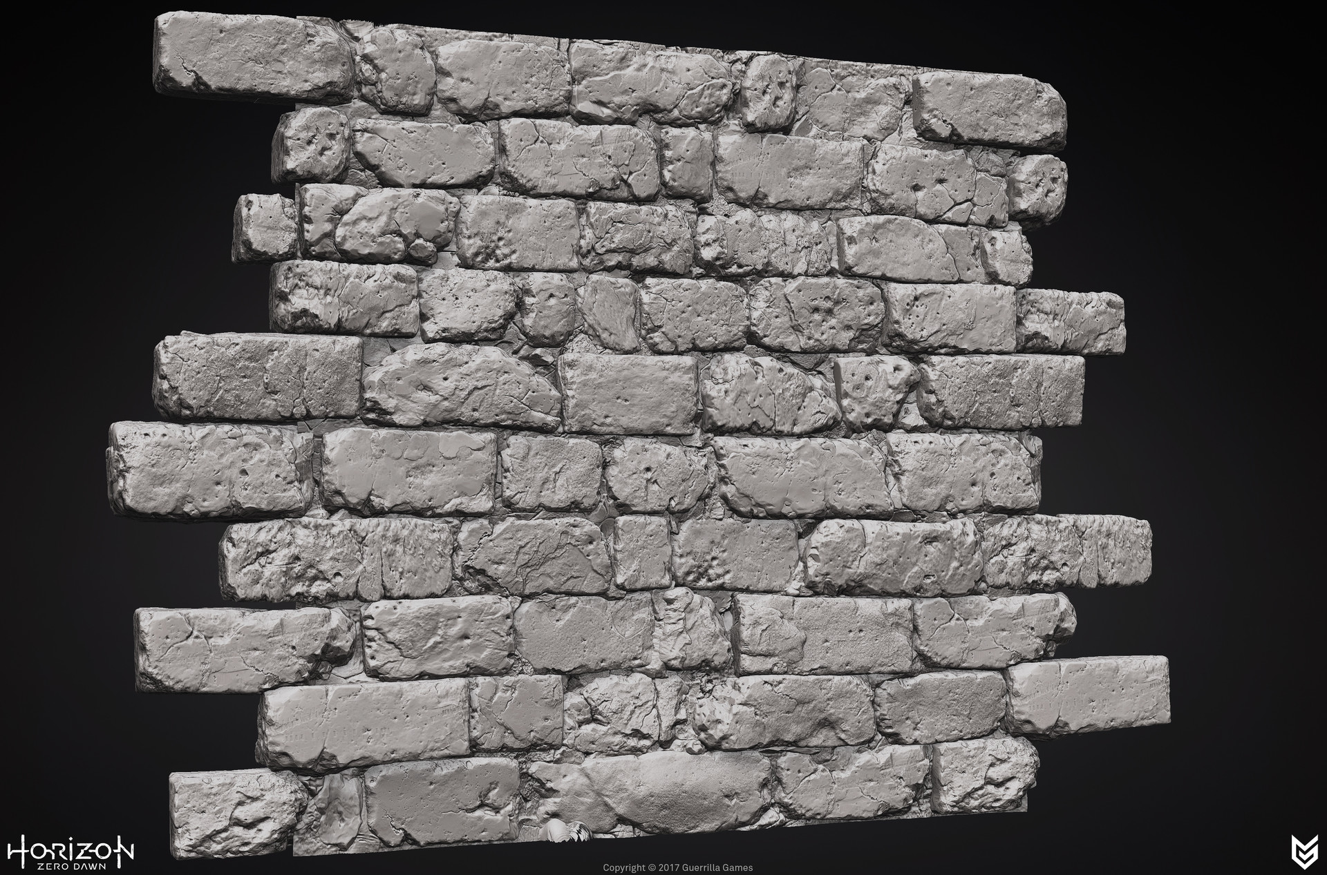
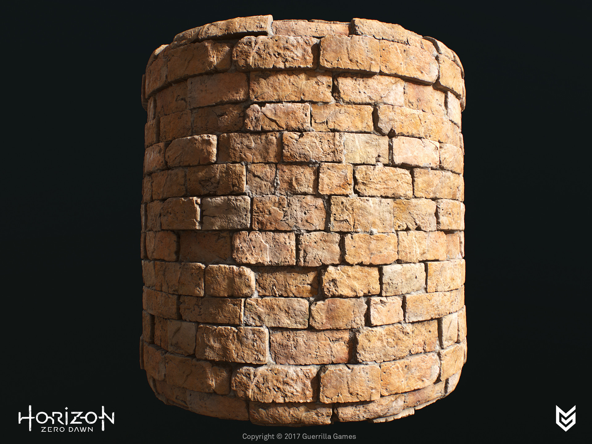
High Poly Brick Sculpting
Since my last post I've been working on these bricks while I was working on a different personal project. Kinda helped me to keep fresh eyes on the project by doing something else once every few days.
I was building a small library of different types of wall bricks.
Two bricks from the previously shown set of bricks but with polypaint to test a bit of lookdev.
Labels:
3D,
asset-art,
environment-art,
environment-artist,
Gears of War,
Gears of War Judgment,
high poly rendering,
texture detailling,
textures,
texturing,
The Last of Us,
video-games,
z-brush,
zbrush sculpting
Wednesday, July 2, 2014
Textured Concrete Pillar
I've been working for a bit on this sculpt and decided to texture it. There are still a few tweaks but I feel I'll keep it like this, been working the low poly/texturing for a few evenings.
Cheers,
Stefan Groenewoud
Environment artist
[Click to enlarge]
Wednesday, May 28, 2014
Monday, May 19, 2014
Fabric sculpting
After a few months I finally got around to sculpt some fabric in Zbrush in my spare time to improve my workflow and simply get everything done in one program. Unfortunately I did have to do a bit of blocking out and fixing model issues outside of Z.
I also got some other projects going but they're not at a stage that it's ready to show yet ;).
Cheers!

Friday, June 21, 2013
When Nature Reclaims The City pt. 2
Damn, I've been so amazed by a lot of new games that have been announced at E3 2013! My favorite at this moment probably is The Division, the amount of detail is insane and very inspiring. If only I could work on their team *hint hint to the guys at Massive, if they even read my blog*. Also got my hands on The Last of Us, amazing game I must say, great story writing, awesome graphics.
Last year I already worked on this environment but I didn't really had the time to work on it that much and also lost the motivation. Few weeks ago I had decided to finish this piece up and I am really curious what y'all think of the result. After seeing The Last of Us art dump I was a bit intimidated xD but heck I can really use the feedback to improve the scene.
Since the last update I had adjusted the light rig & color correction, car(s) have been modelled (not sure if I'll add the Bus as I had planned), added a few extra props to fill the scene, extra/better textures & shaders.
Note: I am using a few placeholders (the trees) from UDK
Thanks for your time!
Stefan Groenewoud
Freelance 3D-artist
I am just sharing my thoughts and interesting artwork to other artists out there. This blog is used for educational purposes and/or tracking of Stefan Groenewoud his personal work.
Tuesday, June 4, 2013
My first character [WIP]
Here's a quick update on my first character design. It was a ton of fun and I'm also working on my second character but that one isn't really near final so, you just have to wait a little longer. ;)
Stefan Groenewoud
Freelance 3D-artist
I am just sharing my thoughts and interesting artwork to other artists out there. This blog is used for educational purposes and/or tracking of Stefan Groenewoud his personal work.
click on the image to enlarge
Stefan Groenewoud
Freelance 3D-artist
I am just sharing my thoughts and interesting artwork to other artists out there. This blog is used for educational purposes and/or tracking of Stefan Groenewoud his personal work.
click on the image to enlarge
Monday, February 11, 2013
Art dump pt.2 - What I Did This Winter
Wall Ornament with test shaders.
Wall Ornament with Final shaders.
Mirror also with final shaders.
Torso Re-do
Beach Scene W.I.P. - I was working on this scene when my PC broke, so I'll be revisiting this one later on.
Z-brush hardsurface study
Stefan Groenewoud
Freelance 3D-artist
I am just sharing my thoughts and interesting artwork to other artists out there. This blog is used for educational purposes and/or tracking of Stefan Groenewoud his personal work.
Tuesday, December 18, 2012
Lighting Artist pt.2
Hey all,
Welcome back on the blog and I'd like to continue with my "special" on the job function called Lighting Artist. Last time I showed some color simplifications to visualize more of the color tones that are being used to set a certain mood in game environments. I haven't learned anything concerning color usage and composition during my study, but as I am writing these blog posts I am learning to understand these topics better. It's not a professionally written post but more or less the findings I discovered and my interpretation of artists' their work. If I'm wrong with any statements I make during these posts, please leave a comment!
Another thing that has been on my mind, one of the biggest game stores in the Netherlands shutdown all of their physical stores and is only going to sell games through their web shop. I'm somewhat disappointed this is happening. I can't imagine any more game stores disappearing because of the economic crisis.
One last thing, I wanted to wish all the people at Trion Worlds who got laid off last week, the best of luck. I think it's a bit of a nasty move to lay off 40 staff members just 2 weeks before Christmas, unfortunately lay offs are a common trend in the games industry.
I used several screenshots of the game and took the first example a bit further. By adding some orange lines I'm pointing out one rule of composition. It's referred to by some as "edge flow" or "lines". This means the eyes are being drawn towards the point of interest because of all the edges that lead the viewers eyes to this PI (point of interest).
In the screenshot with the hallway, all the piping and paneling is hinting the viewer towards the door at the end of the hall. Maybe it's even luring the player/viewer to let him explore what's behind that door.
With the organic/outside screenshot I added orange lines to landscape, I'm pointing out the necessity of having enough positive and negative space usage and the interest of shapes. For example the rocks have a very interesting and organic look and feel. From a distance it's already noticeable that the objects are rocks, that's why we're using silhouettes. Having shapes of objects be as clear a possible to the viewers eyes, e.g. the rough figure of rocks are very easily recognized -> makes the scene more believable.
You're probably asking, why the grey scaled images? Colors can be very distracting at times, by making them grey-scaled, I made it visually more understanding for myself. It helps to see where all the shadows and light sources come from, another important aspect is the sense of depth. Objects from far away become desaturated/blueish tinted.
The contrast becomes lower the further you look away from the "camera", the grey scales are your visual evidence it works. Of course this rule is mainly applied for outside environment/landscapes.
This blog post turned from just Lighting Artist also towards a few rules for compositions haha. I'm gonna end it here, I'm out of writing material even though I haven't discussed everything yet, but feel free to leave your thoughts down below.
One last line, "Happy Christmas and a happy New Year!".
Have a good day!
Cheers,
Stefan Groenewoud
Freelance 3D-artist
I do not own the rights concerning the work of Tomas Lidström nor 343 Industries, I am just sharing my thoughts and interesting artwork to other artists out there. This blog is used for educational purposes and/or tracking of Stefan Groenewoud his personal work.
Welcome back on the blog and I'd like to continue with my "special" on the job function called Lighting Artist. Last time I showed some color simplifications to visualize more of the color tones that are being used to set a certain mood in game environments. I haven't learned anything concerning color usage and composition during my study, but as I am writing these blog posts I am learning to understand these topics better. It's not a professionally written post but more or less the findings I discovered and my interpretation of artists' their work. If I'm wrong with any statements I make during these posts, please leave a comment!
Intro
Before I go any further with the lighting artist special, I just wanted to tell what I've been up to lately. This weekend I've been polishing my online portfolio. Mainly adding some extra screenshots for projects and adding some description. Also optimizing jpg's is a big thing! The smaller the images the quicker the site loads, I kept this in mind but of course you don't want your high poly mesh showing up as pixel art.Another thing that has been on my mind, one of the biggest game stores in the Netherlands shutdown all of their physical stores and is only going to sell games through their web shop. I'm somewhat disappointed this is happening. I can't imagine any more game stores disappearing because of the economic crisis.
One last thing, I wanted to wish all the people at Trion Worlds who got laid off last week, the best of luck. I think it's a bit of a nasty move to lay off 40 staff members just 2 weeks before Christmas, unfortunately lay offs are a common trend in the games industry.
Lighting Artists pt. 2
The following examples show off how crucial color contrasts and silhouettes are to make a believable and good looking scene. With the example that I showed off last time, concerning Tomas Lidström his work, I took the liberty of showing the differences between the edited and original version. The color contrast is very noticeable at this point but also the importance of silhouettes are becoming more clear.
Halo 4
I'm a very big fan of the artwork in Halo 4, although I haven't played it myself (yet). The environments are highly detailed and has an incredibly awesomeness of varying atmospheres. Most of you have already read the article on the Environment Art on Halo 4 but here is the link anyways.I used several screenshots of the game and took the first example a bit further. By adding some orange lines I'm pointing out one rule of composition. It's referred to by some as "edge flow" or "lines". This means the eyes are being drawn towards the point of interest because of all the edges that lead the viewers eyes to this PI (point of interest).
In the screenshot with the hallway, all the piping and paneling is hinting the viewer towards the door at the end of the hall. Maybe it's even luring the player/viewer to let him explore what's behind that door.
With the organic/outside screenshot I added orange lines to landscape, I'm pointing out the necessity of having enough positive and negative space usage and the interest of shapes. For example the rocks have a very interesting and organic look and feel. From a distance it's already noticeable that the objects are rocks, that's why we're using silhouettes. Having shapes of objects be as clear a possible to the viewers eyes, e.g. the rough figure of rocks are very easily recognized -> makes the scene more believable.
You're probably asking, why the grey scaled images? Colors can be very distracting at times, by making them grey-scaled, I made it visually more understanding for myself. It helps to see where all the shadows and light sources come from, another important aspect is the sense of depth. Objects from far away become desaturated/blueish tinted.
The contrast becomes lower the further you look away from the "camera", the grey scales are your visual evidence it works. Of course this rule is mainly applied for outside environment/landscapes.
This blog post turned from just Lighting Artist also towards a few rules for compositions haha. I'm gonna end it here, I'm out of writing material even though I haven't discussed everything yet, but feel free to leave your thoughts down below.
One last line, "Happy Christmas and a happy New Year!".

Have a good day!
Cheers,
Stefan Groenewoud
Freelance 3D-artist
I do not own the rights concerning the work of Tomas Lidström nor 343 Industries, I am just sharing my thoughts and interesting artwork to other artists out there. This blog is used for educational purposes and/or tracking of Stefan Groenewoud his personal work.
Sunday, November 25, 2012
In the desert
Hey there,
Soooo, I'm back again with another blogpost that I'm writing during lunch time. It's not so much of an impressive post like last time though, concerning my personal work. I did try to make a matte painting, it's still very work in progress.
And I took the liberty of starting on a new small environment that is taking place in the desert. The shader is pretty basic but it was fun to try out several setups and creating a basic atmosphere. I do need to make a paintover so I can figure out a good focal point that will pull the interest in the scene. Ah well, as an artist you always have a shortage of time, unfortunately. Please leave some crits if you have the time to do so!
For this post I was looking for a different type of artist, not an environment artist nor weapon artist, no this time I looked for a function in gaming that isn't very popular. Lighting artist! As far as I know, there aren't that many of these guys in the games industry.
Like I said, this time I'll show some work of lighting artist Tomas Lidström. He has quite the list of gametitles on his name already! Especially Gears of War Judgement and Bulletstorm are the titles that I admire. Although Bulletstorm wasn't a bestselling game, I do love the environments and unique atmosphere in the game.
Tomas's portfolio: http://portfolio.tomaslidstrom.com/
By the way, I'd like to thank all the artists out there who gave me the permission to use their work for this purpose!
I'd recommend to open the images in a new window to see the full resolution.
Small color study, I extracted some colors to have a better understanding how lighting artists use their colors wisely to create a certain atmosphere in their environment. Lighting is very important to steer the viewers eye around in an environment/screenshot/painting. In the high contrast images the viewers eye is constantly drawn towards the lightest/most intense light source. Proper lighting setup isn't the only thing that makes an environment complete, the silhouettes are making the shapes of the environment way more interesting.
Have a good day!
Cheers,
Stefan Groenewoud
Freelance 3D-artist
I do not own the rights concerning the work of Tomas Lidström, I am just sharing my thoughts and interesting artwork to other artists out there.
Soooo, I'm back again with another blogpost that I'm writing during lunch time. It's not so much of an impressive post like last time though, concerning my personal work. I did try to make a matte painting, it's still very work in progress.
And I took the liberty of starting on a new small environment that is taking place in the desert. The shader is pretty basic but it was fun to try out several setups and creating a basic atmosphere. I do need to make a paintover so I can figure out a good focal point that will pull the interest in the scene. Ah well, as an artist you always have a shortage of time, unfortunately. Please leave some crits if you have the time to do so!
For this post I was looking for a different type of artist, not an environment artist nor weapon artist, no this time I looked for a function in gaming that isn't very popular. Lighting artist! As far as I know, there aren't that many of these guys in the games industry.
Lighting artist job
The main task for an lighting artist is, of course, lighting up the environment, duh! Kidding aside, besides that post processing is also one of their tasks,this means keeping the color key of the environment in mind, LOD'ing, optimizing assets, (re-)UVing secondary UV-sets and creating paintovers to try out different atmospheric ideas. For some it might sound pretty easy but I do think it's a pretty challenging job, it's not just dumping in a few dynamic lights and calling it a day. A good lighting artist knows how to flesh out his environment with lighting and keeping the environment readable for the eyes.Like I said, this time I'll show some work of lighting artist Tomas Lidström. He has quite the list of gametitles on his name already! Especially Gears of War Judgement and Bulletstorm are the titles that I admire. Although Bulletstorm wasn't a bestselling game, I do love the environments and unique atmosphere in the game.
Tomas's portfolio: http://portfolio.tomaslidstrom.com/
By the way, I'd like to thank all the artists out there who gave me the permission to use their work for this purpose!
I'd recommend to open the images in a new window to see the full resolution.
Small color study, I extracted some colors to have a better understanding how lighting artists use their colors wisely to create a certain atmosphere in their environment. Lighting is very important to steer the viewers eye around in an environment/screenshot/painting. In the high contrast images the viewers eye is constantly drawn towards the lightest/most intense light source. Proper lighting setup isn't the only thing that makes an environment complete, the silhouettes are making the shapes of the environment way more interesting.
Matte painting tryout
Tile test
Desert starting point
Tomas Lidström his work:
Some color testing for one of Tomas's personal projects.
Thanks for reading the post and please share this if you can. =]
Have a good day!
Cheers,
Stefan Groenewoud
Freelance 3D-artist
I do not own the rights concerning the work of Tomas Lidström, I am just sharing my thoughts and interesting artwork to other artists out there.
Labels:
environment-artist,
games,
Gears of War,
high poly,
lighting,
lighting-artist.,
lightsetup,
matte painting,
paint over,
post-apocalyptic,
Sculpting,
Stefan Groenewoud,
textures,
texturing,
tomas lidstrom,
z-brush
Sunday, November 11, 2012
High poly artdump
Hey there,
Well it was pretty busy for the last few weeks, been doing a course and some freelance work! This weekend I took some time off to relax a bit, playing some games again and it was time for another blog post. Another highlight of the week is, I'm considering to go back to school for a Bachelor diploma in Game-Architecture. I already got in the selection for this course last school year but my last school didn't send the paperwork in time so I got removed of the candidate list!
I'd recommend to open the images in a new window to see the full resolution.
Off-topic: Windows 8 was released recently, what are your thoughts about this? Are most 3D/2D programs compatible with this new OS?
Here's some work I've done the last 2-3 weeks:
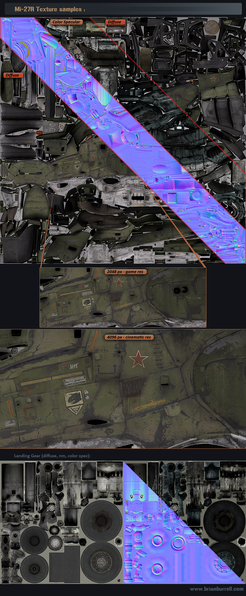
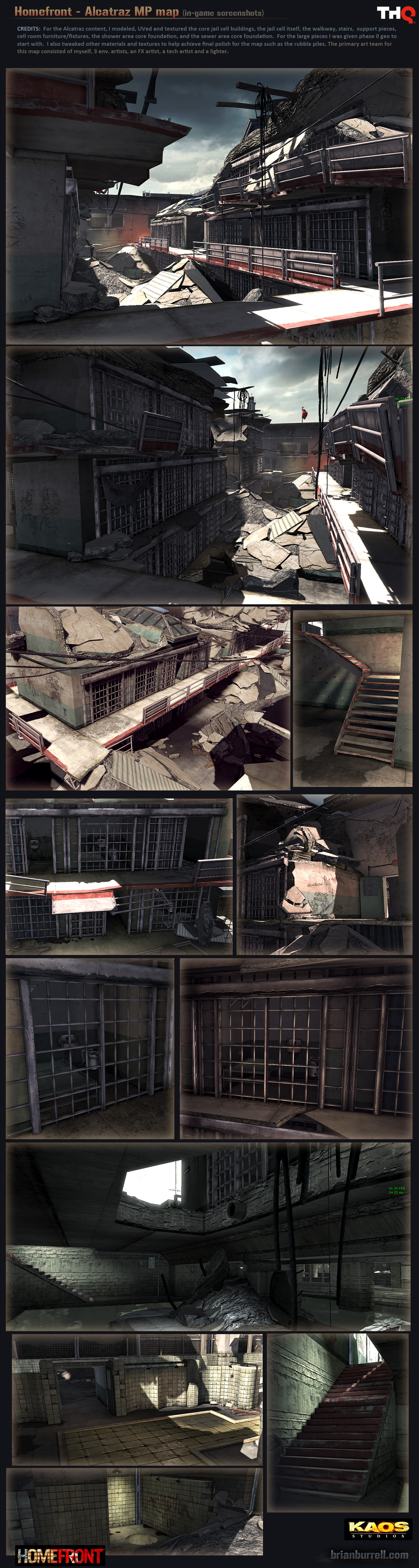
The artist that is being highlighted this time is Brian Burrell. He has done some amazing work on Homefront (as art supervisor and senior artist) but also has very interesting personal work. Don't forget to checkout his website, this contains all the in depth information concerning his art supervising work. Personally, I loved the game Homefront, the weapons really caught my attention, unfortunately it wasn't a big commercial success, which led to the shutdown of Kaos Studio.
Bryan's personal work:
Work on Homefront in collaboration with other artists:
Thanks for reading the post and please share this if you can. =]
Have a good Sunday!
Cheers,
Stefan Groenewoud
Freelance 3D-artist
I do not own the rights concerning the work of Bryan Burrell, I am just sharing my thoughts and interesting artwork to other artists out there.
Well it was pretty busy for the last few weeks, been doing a course and some freelance work! This weekend I took some time off to relax a bit, playing some games again and it was time for another blog post. Another highlight of the week is, I'm considering to go back to school for a Bachelor diploma in Game-Architecture. I already got in the selection for this course last school year but my last school didn't send the paperwork in time so I got removed of the candidate list!
I'd recommend to open the images in a new window to see the full resolution.
Here's some work I've done the last 2-3 weeks:
The artist that is being highlighted this time is Brian Burrell. He has done some amazing work on Homefront (as art supervisor and senior artist) but also has very interesting personal work. Don't forget to checkout his website, this contains all the in depth information concerning his art supervising work. Personally, I loved the game Homefront, the weapons really caught my attention, unfortunately it wasn't a big commercial success, which led to the shutdown of Kaos Studio.
Bryan's personal work:
Work on Homefront in collaboration with other artists:
Thanks for reading the post and please share this if you can. =]
Have a good Sunday!
Cheers,
Stefan Groenewoud
Freelance 3D-artist
I do not own the rights concerning the work of Bryan Burrell, I am just sharing my thoughts and interesting artwork to other artists out there.
Subscribe to:
Posts (Atom)